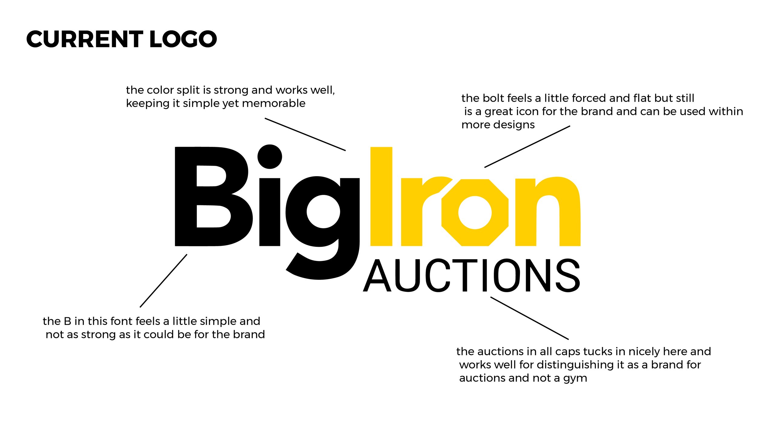
BRANDING
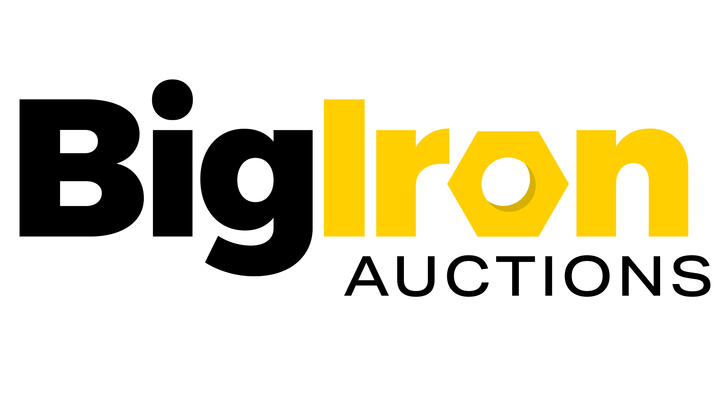
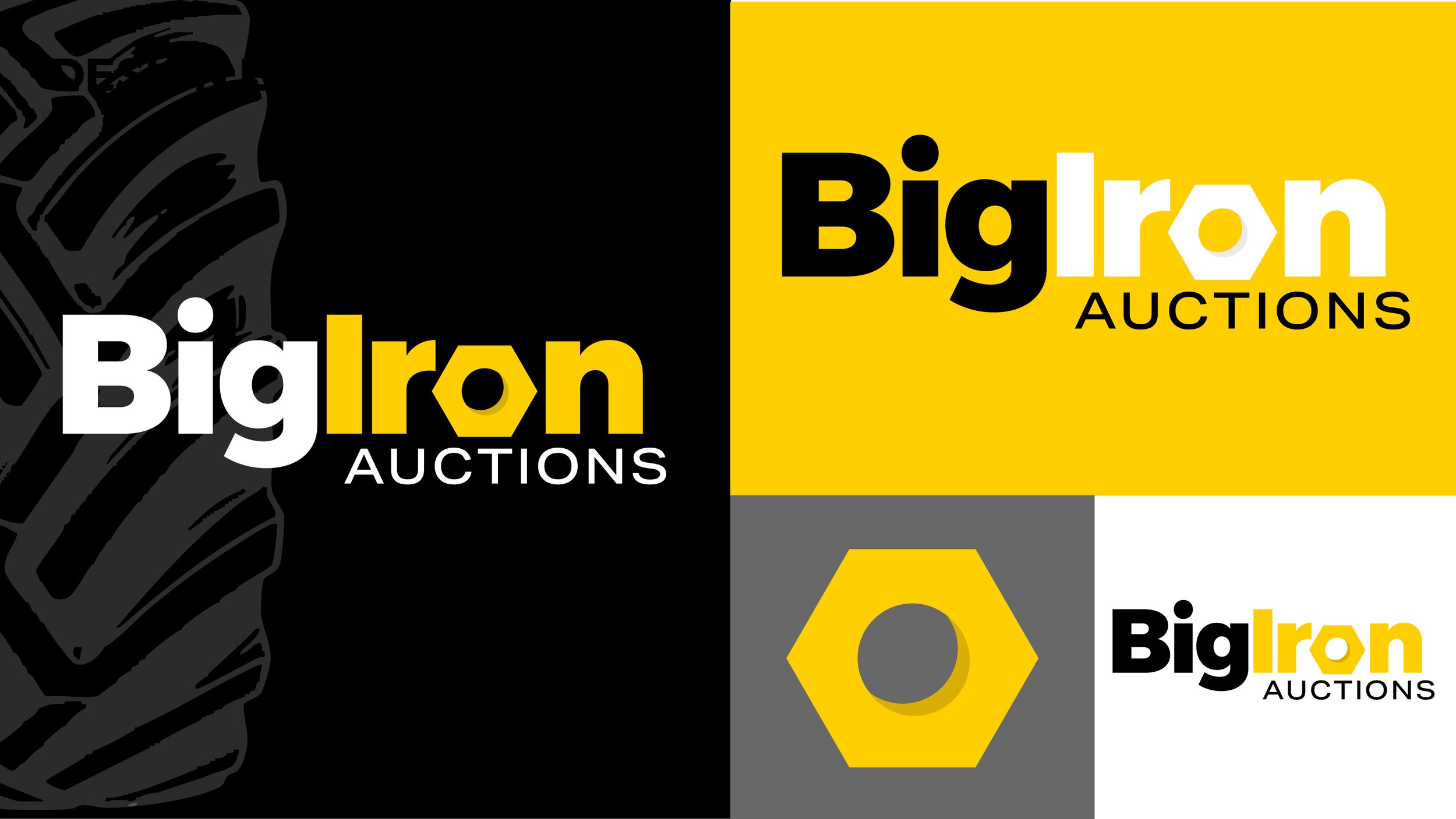
This project focused on refining the existing BigIron Auctions logo through a subtle, modern update. The goal was to maintain brand recognition while introducing a more polished and dimensional look. Updates included adjusting the nut icon by refining its shape and number of sides, incorporating shadow for added depth, and making slight typographic enhancements to improve overall balance and readability.
The inspiration for this update began with a close analysis of the existing BigIron Auctions logo—identifying what was working, what wasn’t, and where there was opportunity for refinement. From there, the goal was to build upon those established elements while improving how the mark performs within current design applications. Equal consideration was given to how the logo could better support future layouts, creating a more flexible and cohesive visual foundation moving forward.
INSPIRATION
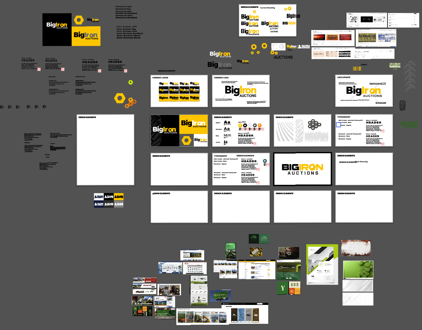
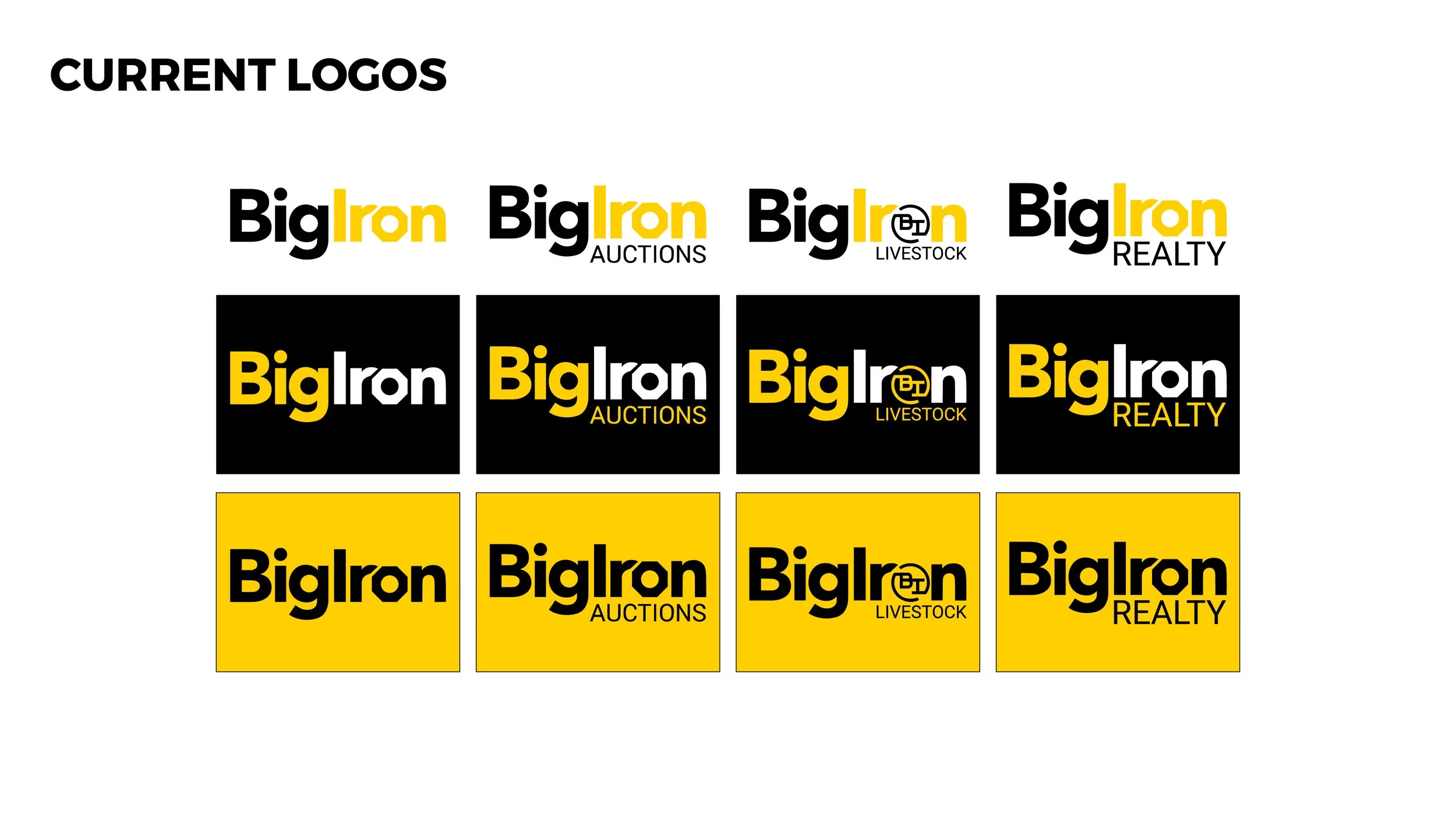
Another key consideration was BigIron’s expansive catalog of sub-brands and logos. With a wide range of visual marks across different divisions and offerings, there was an opportunity to create a more unified system. This update aimed to help consolidate that variety under a stronger, more cohesive BigIron Auctions master logo—establishing clearer brand consistency while still allowing flexibility across the broader catalog.
Key Considerations
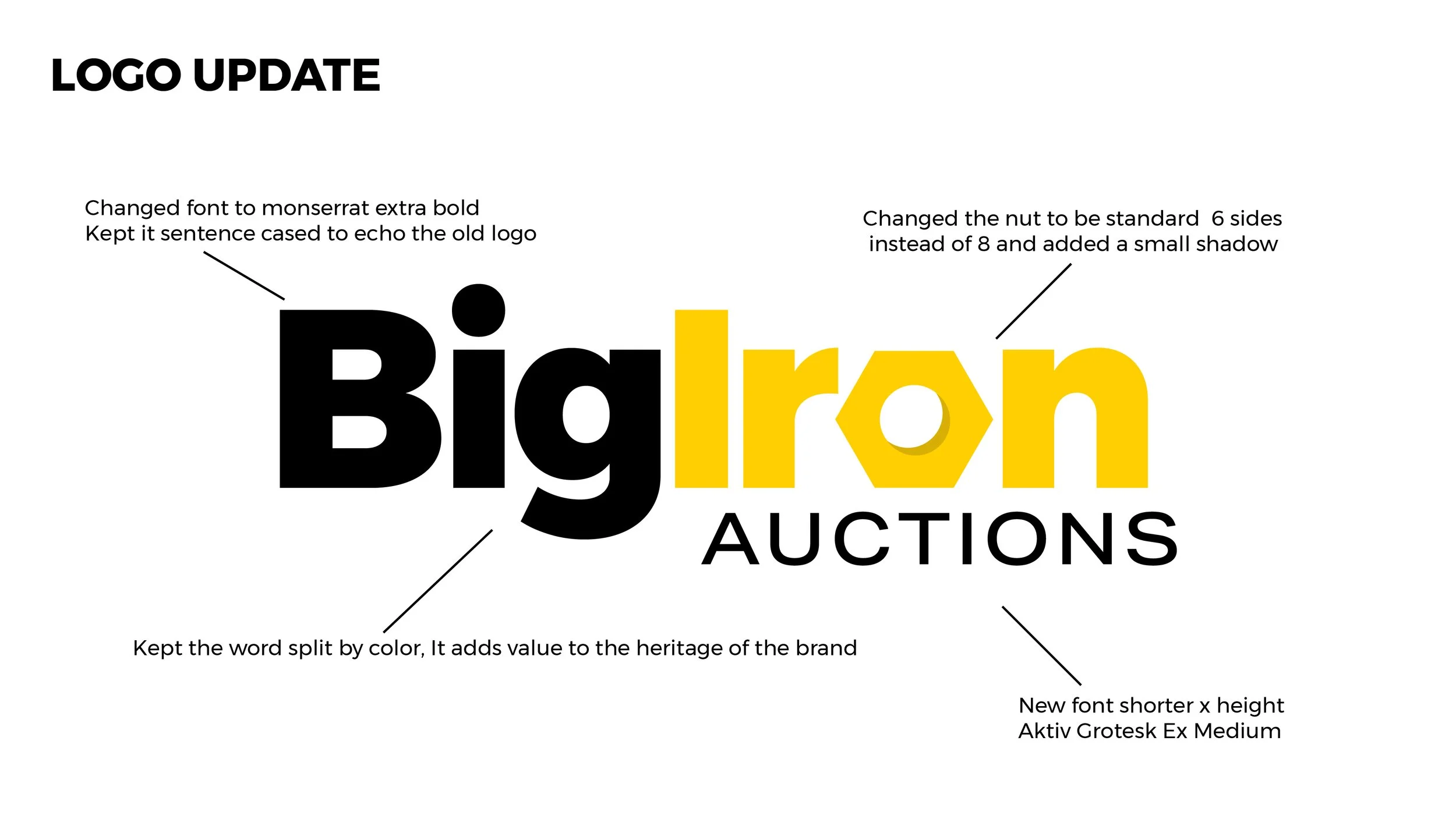
FINAL LOGO
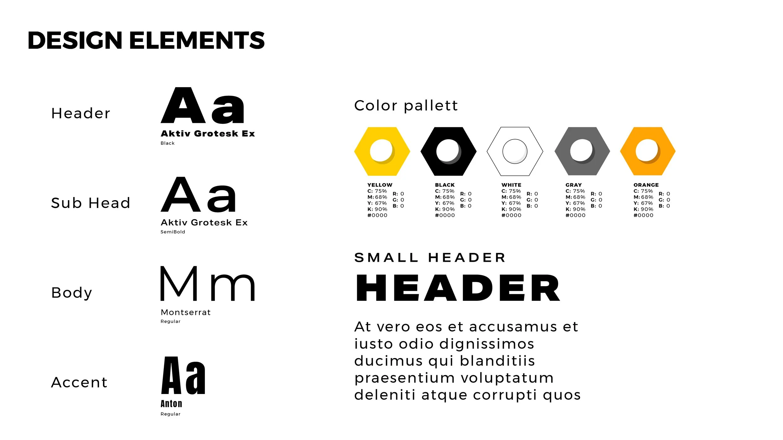
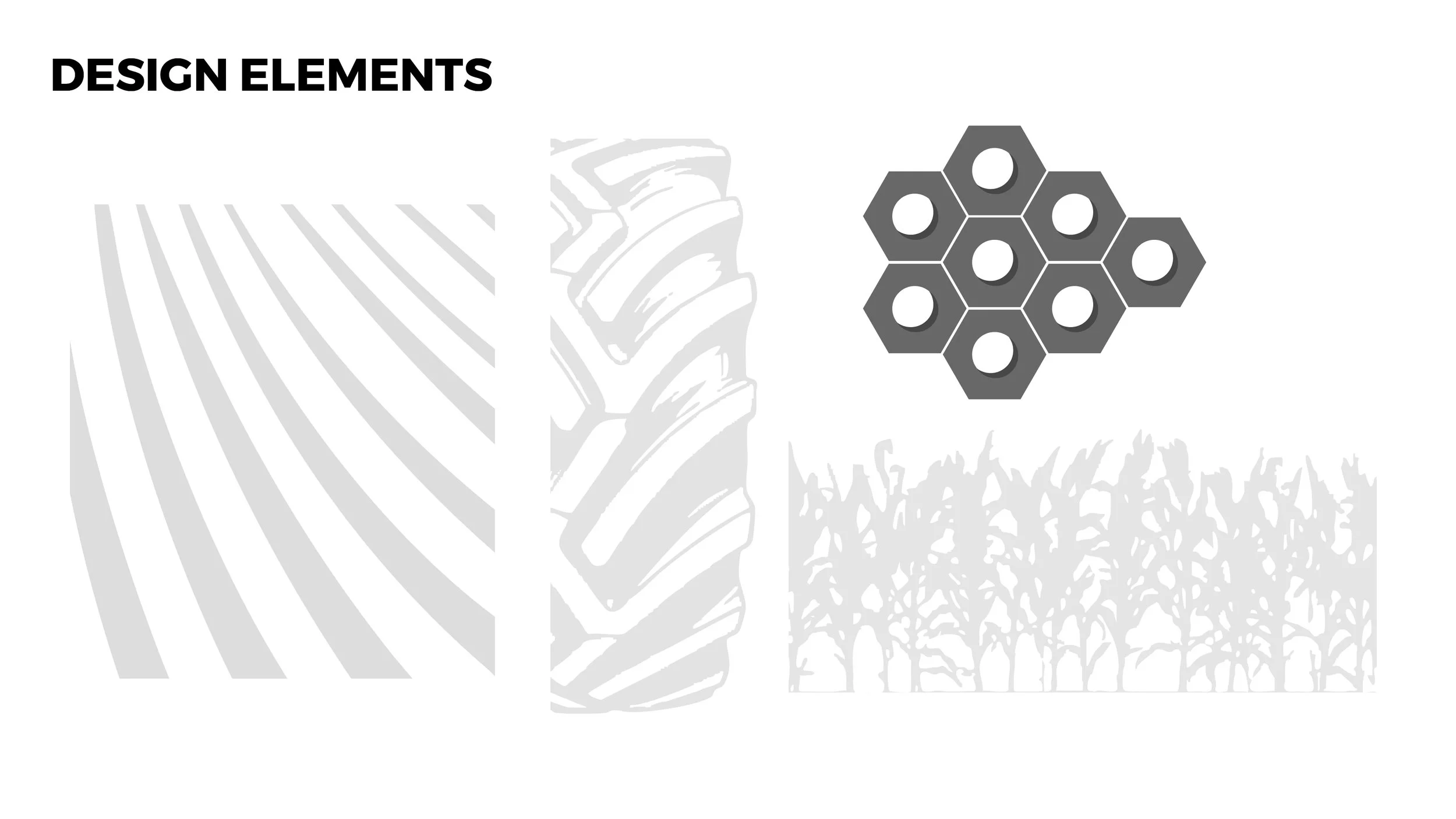
The final logo introduces a series of subtle yet impactful refinements that elevate the overall brand. Updates to the primary mark enhance clarity and balance, while the addition of a secondary color palette expands flexibility across applications. Supporting design elements—such as tire track textures—were incorporated to reinforce the brand’s connection to equipment and auction environments. Typography was also updated with the introduction of Aktiv Grotesk, bringing in a shorter, bolder font family that improves legibility and adds a more modern, grounded presence across the system.